

NCERT Class 9 Maths Chapter 14 Notes - Statistics Download PDF
Statistics is an applied mathematics that deals with the collection, interpretation and analysis of data. Statistics is used to compute, manipulate or organise data. Many types of manipulation operations can be performed on large data sets. With the help of statistics, different types of data can be compared in a single frame. It is used to convert the raw data into useful information. There are many applications of statistics, like weather forecasting, probability, geology, psychology, and medical studies, etc. Some real-life applications are in business, like marketing for comparing market trends.
This Story also Contains
- Class 9 Chapter 12 Statistics Notes PDF – Download Free Study Material
- NCERT Class 9 Maths Chapter 12 Statistics: Notes
- How to Use the Statistics Class 9 Notes Effectively?
- Statistics Class 9 Notes: Previous Year Question and Answer
- NCERT Class 9 Maths Notes – Chapter-Wise Links
In these notes, students learn the definition of statistics and its basic concepts, such as data, frequency, types of data, class intervals and their types, and related formulae, such as mean, mode, or median. Class 9 Chapter 12 includes questions and examples for the given topics as required. In these NCERT class 9th maths notes, all the chapters, topics, and subtopics are covered according to the latest syllabus. Students from different standards can download the NCERT notes according to their requirements.
Also, read,
Class 9 Chapter 12 Statistics Notes PDF – Download Free Study Material
Careers360 brings you NCERT Class 9 Maths Chapter 12 Statistics notes, carefully prepared by subject experts to simplify your studies and help in exams. A downloadable PDF is available — click the link below to access it.
NCERT Class 9 Maths Chapter 12 Statistics: Notes
Statistics
A branch of mathematics concerned with data collection, analysis, interpretation and presentation is known as statistics.
Data
Any numerical or non-numerical figures, facts or other information that is collected for a particular purpose is called data.
Frequency
The number of occurrences of a particular datum is called the frequency.
Ungrouped Data
When the observation is not organised in groups, then this type of data is called ungrouped data.
Grouped Data
When the observations are organised in groups, this is called grouped data.
Class Interval
The size of the data on which the class is divided is called the class interval.
Class width = upper class limit – lower class limit
Regular and Irregular Class Interval
When the class interval is of the same size, it is called a regular class interval.
Example: 0 - 10, 10 - 20, 20 - 30, 30 - 40
When the class interval is of a different size, it is called an irregular class interval.
Example: 0 - 10, 10 - 35, 35 - 45, 45 - 60
Frequency Table
It shows the occurrence of a particular variable in a tabular form.
Sorting
Arranging data in a particular order (ascending or descending order) is called sorting data.
Ungrouped Frequency Table
A frequency table in which data is not arranged in any particular order, then is called an ungrouped frequency table.
Grouped Frequency Table
A frequency table in which data is arranged in any particular order, either in ascending or descending order then is called a grouped frequency table.
Graphical Representation of Data
Some of the graphical representations of data are as follows.
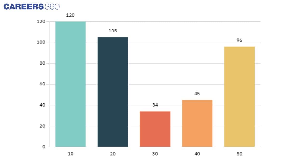
Bar Graphs
Bar graphs represent data using bars of equal width and space between them on the axis. The frequency of data is represented through the height of the bar. Bar graphs are used for discrete data intervals.
For example:
| Number of People | Weight (Frequency) |
| 10 | 120 |
| 20 | 105 |
| 30 | 34 |
| 40 | 45 |
| 50 | 96 |
| Total | 400 |
The representation of these data in a bar graph is as follows.
Histogram
Similar to the bar graph, histograms are also used for the graphical representation of data, but this is used for continuous data intervals. In this graph, the area of the rectangle or frequency represented by the height of the graph and the width is called the class intervals.
Frequency Polygon
When the midpoints of each rectangle are joined by using line segments in the histogram, this is called the frequency polygon. It can be drawn without a histogram.
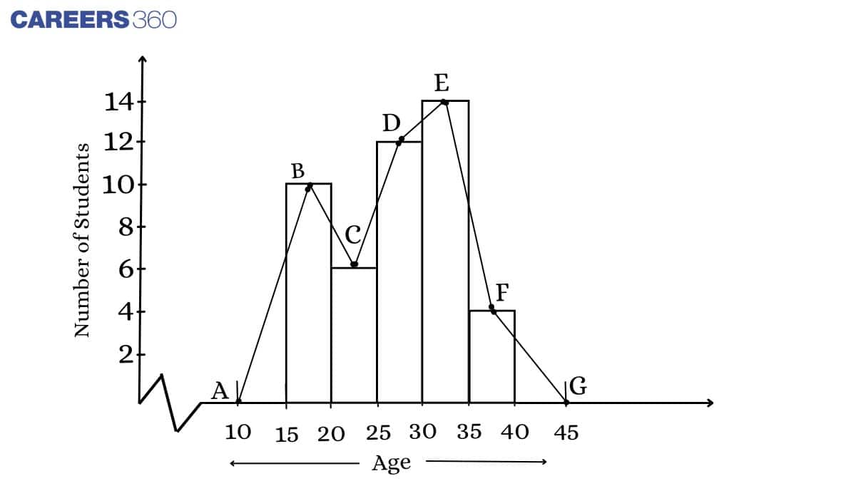
Midpoint of the Class Interval
The class mark or the midpoint of the circle can be calculated as:
Class mark = $\frac{\text{(Upper limit + Lower limit)}}{2}$
A frequency polygon can be drawn using the given class mark.
Example: In a company, employees of different departments work for different numbers of months and the tabular data is shown below. Draw the histogram for the table shown below.
| Number of Employees | Number of Months |
| 50 - 100 | 7 |
| 100 -150 | 10 |
| 150 - 200 | 20 |
| 200 - 250 | 6 |
| Total | 43 |
Class mark = $\frac{\text{(Upper limit + Lower limit)}}{2}$
Class mark = $\frac{(100 + 50)}{2}$ = 75
Similarly, determine the class mark for all values.
| Number of Employees | Class Marks | Number of Months |
| 50 - 100 | 75 | 8 |
| 100 -150 | 125 | 10 |
| 150 - 200 | 175 | 20 |
| 200 - 250 | 225 | 8 |
| Total | 45 | |
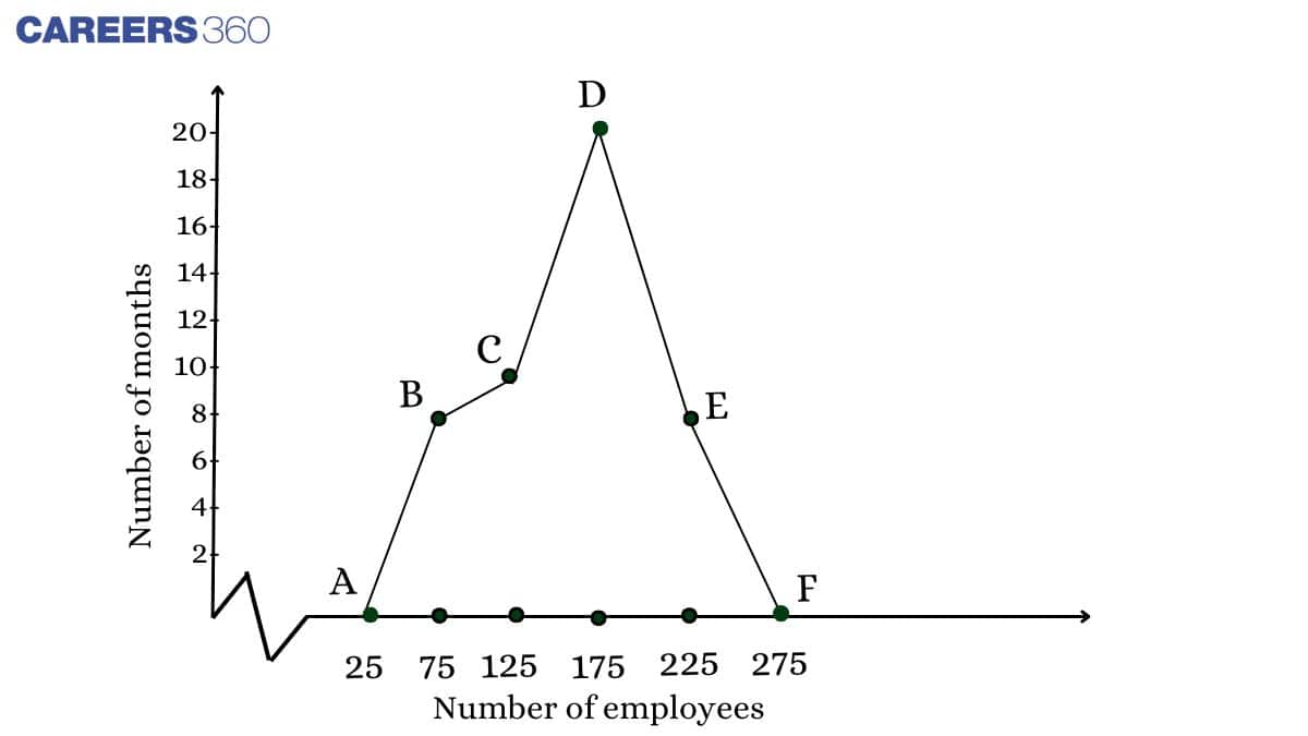
The histogram for the given tabular data is shown below; in this graph, ABCDEF is called the frequency polygon.
Confused between CGPA and Percentage?
Get your results instantly with our calculator!
How to Use the Statistics Class 9 Notes Effectively?
Statistics become easier when we understand how data is collected and shown using graphs. This chapter primarily teaches us how to read and interpret graphs in a simple way. When we revise these ideas slowly, working with data becomes much easier. Class 9 Maths chapter 12 notes help us do that. Here are some more points on how these notes are important.
- Read the examples of bar graphs and other graphs first so we understand how data is shown.
- Practise drawing simple graphs to learn how to label axes and plot values correctly.
- Keep the NCERT Class 9 Maths chapter 12 notes with you when solving questions to check steps and avoid mistakes.
- Use the NCERT Class 9 Maths chapter 12 notes to build a strong base, because these data and graph skills help us again in higher classes and real-life maths.
Statistics Class 9 Notes: Previous Year Question and Answer
Question 1:
The mean of 20 observations was 42. It was found later that observation 54 was wrongly taken as 45. The corrected new mean is:
Solution:
The mean of 20 initial observations = 42
Sum of initial observations = 42 × 20 = 840
Wrong entry = 45
Correct entry = 54
Sum after correction = 840 – 45 + 54 = 849
$\therefore$ Final mean = $\frac{849}{20}$ = 42.45
Hence, the correct answer is 42.45.
Question 2:
The median of the following data will be _________.
32, 25, 33, 27, 35, 29, and 30
Solution:
Given numbers:
32, 25, 33, 27, 35, 29, and 30
⇒ the given data is in ascending order = 25, 27, 29, 30, 32, 33, 35
The median of this data is the middlemost number of this data (as the total number of data is odd)
So, median term = $[\frac{7 + 1}{2}]^{th}$
= $[\frac{8}{2}]^{th}$
= $4^{th}$ term
⇒ Median = 30
Hence, the correct answer is 30.
Question 3:
Find the mode for the given distribution (rounded off to two decimal places).
| Class Interval | 5-10 | 10-15 | 15-20 | 20-25 | 25-30 | 30-35 |
| Frequency | 8 | 7 | 6 | 9 | 11 | 10 |
Solution:
Here, the maximum frequency is 11, and the corresponding class is 25–30.
So the modal class is 25–30.
Now lower limit of the modal class ($l$) = 25,
Frequency of the modal class ($f_1$) = 11
Frequency of the preceding modal class ($f_0$) = 9
Frequency of the succeeding modal class ($f_2$) = 10
class size ($h$) = 5
We know, mode = $l + (\frac{f_1-f_0}{2f_1-f_0-f_2})×h$
= $25 + (\frac{11-9}{2(11)-9-10})×5$
= $25 + (\frac{2}{3})×5$
= $25 + 3.33$
= $28.33$
Hence, the correct answer is 28.33.
NCERT Class 9 Maths Notes – Chapter-Wise Links
We at Careers360 compiled all the NCERT class 9 Maths notes in one place for easy student reference. The following links will allow you to access them.
|
NCERT Notes for Class 9 Maths Chapter 4 Linear Equations in Two Variables |
|
NCERT Notes for Class 9 Maths Chapter 5 Introduction to Euclid’s Geometry |
|
NCERT Notes for Class 9 Maths Chapter 11 Surface Areas and Volumes |
|
NCERT Notes for Class 9 Maths Chapter 12 Statistics |
NCERT Solutions for Class 9
Students must check the NCERT solutions for Class 9 Maths and Science given below:
NCERT Exemplar Solutions for Class 9
Students must check the NCERT exemplar solutions for Class 9 Maths and Science given below:
NCERT Books and Syllabus
To learn about the NCERT books and syllabus, read the following articles and get a direct link to download them.

Popular Questions
A block of mass 0.50 kg is moving with a speed of 2.00 ms-1 on a smooth surface. It strikes another mass of 1.00 kg and then they move together as a single body. The energy loss during the collision is
| Option 1)
|
Option 2)
|
| Option 3)
|
Option 4)
|
An athlete in the olympic games covers a distance of 100 m in 10 s. His kinetic energy can be estimated to be in the range
| Option 1)
|
Option 2)
|
| Option 3)
|
Option 4)
|
A particle is projected at 600 to the horizontal with a kinetic energy . The kinetic energy at the highest point
| Option 1)
|
Option 2)
|
| Option 3)
|
Option 4)
|
In the reaction,
| Option 1)
|
Option 2)
|
| Option 3)
|
Option 4)
|
How many moles of magnesium phosphate, will contain 0.25 mole of oxygen atoms?
| Option 1)
0.02 |
Option 2)
3.125 × 10⁻² |
| Option 3)
1.25 × 10⁻² |
Option 4)
2.5 × 10⁻² |