Search Colleges, Exams, Schools & more


Login
NCERT Solutions for Class 9 Maths Chapter 12 Exercise 12.1 - Statistics
Statistics functions as a mathematical field that handles all aspects of assembling data and then organising and analysing the information with interpretations. A substantial amount of raw data appears in our daily life, including weather reports and class test scores. The disorganised data fails to provide valuable information to readers. We learn about data handling frequencies alongside graphical representation methods. A data grouping system allows us to understand random information while generating fast, useful outcomes.
This Story also Contains
- NCERT Solutions Class 9 Maths Chapter 12: Exercise 12.1
- Access Solution of Number Systems Class 9 Chapter 12 Exercise: 12.1
- Topics covered in Chapter 12 Statistics: Exercise 12.1
- NCERT Solutions of Class 10 Subject Wise
- NCERT Exemplar Solutions of Class 10 Subject Wise

Students can freely access NCERT Solutions Class 9 Mathematics Exercise 12.1 PDF files without internet access, while receiving them at zero cost. The NCERT Books are accessible, providing Exercises, together with all chapters and subjects for in-depth study. It functions as an essential tool for solidifying knowledge, which leads to a complete understanding of problems and their practical applications.
Access Solution of Number Systems Class 9 Chapter 12 Exercise: 12.1
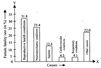
| Serial Number | Causes | Female fatality rate (%) |
| 1. | Reproductive health conditions | 31.8 |
| 2. | Neuropsychiatric conditions | 25.4 |
| 3. | Injuries | 12.4 |
| 4. | Cardiovascular conditions | 4.3 |
| 5. | Respiratory conditions | 4.1 |
| 6. | Other causes | 22.0 |
Represent the information given above graphically
Answer:
The graphical representation of the given data is as follows:
| Serial Number | Causes | Female fatality rate (%) |
| 1. | Reproductive health conditions | 31.8 |
| 2. | Neuropsychiatric conditions | 25.4 |
| 3. | Injuries | 12.4 |
| 4. | Cardiovascular conditions | 4.3 |
| 5. | Respiratory conditions | 4.1 |
| 6. | Other causes | 22.0 |
Which condition is the major cause of women’s ill health and death worldwide?
Answer:
Records from the graph demonstrate that reproductive health conditions represent the biggest factor which leads to worldwide women's deaths and illnesses. Reproductive health conditions cause fatality in 31.8% of women throughout the world.
| Serial Number | Causes | Female fatality rate (%) |
| 1. | Reproductive health conditions | 31.8 |
| 2. | Neuropsychiatric conditions | 25.4 |
| 3. | Injuries | 12.4 |
| 4. | Cardiovascular conditions | 4.3 |
| 5. | Respiratory conditions | 4.1 |
| 6. | Other causes | 22.0 |
Try to find out, with the help of your teacher, any two factors which play a major role in the cause in (ii) above being the major cause
Answer:
Women experience major illnesses and deaths throughout the globe because of inadequate healthcare coverage, coupled with their economically struggling situations.
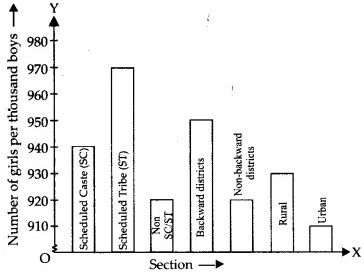
| Section | Number of girls per thousand boys |
| Schedule Caste (SC) | 940 |
| Schedule Tribe (ST) | 970 |
| Non SC/ST | 920 |
| Backward districts | 950 |
| Non-backward districts | 920 |
| Rural | 930 |
| Urban | 910 |
Represent the information above by a bar graph.
Answer:
The graphical representation of the given information is as follows:
| Section | Number of girls per thousand boys |
| Schedule Caste (SC) | 940 |
| Schedule Tribe (ST) | 970 |
| Non SC/ST | 920 |
| Backward districts | 950 |
| Non-backward districts | 920 |
| Rural | 930 |
| Urban | 910 |
In the classroom discuss what conclusions can be arrived at from the graph
Answer:
The graph reveals that urban society has the fewest number of girls per thousand boys, yet the Scheduled Tribes have the most girls per thousand boys: 910 in the case of urban society and 970 in that of the Scheduled Tribes.
| Political Party | A | B | C | D | E | F |
| Seats Won | 75 | 55 | 37 | 29 | 10 | 37 |
Draw a bar graph to represent the polling results.
Answer:
The representation of the given data in the form of a bar graph is as follows:
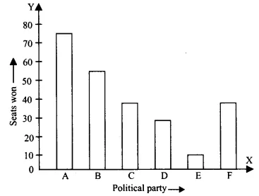
| Political Party | A | B | C | D | E | F |
| Seats Won | 75 | 55 | 37 | 29 | 10 | 37 |
Which political party won the maximum number of seats?
Answer:
From the data, we can clearly see that Party A has a maximum number of seats, that is 75.
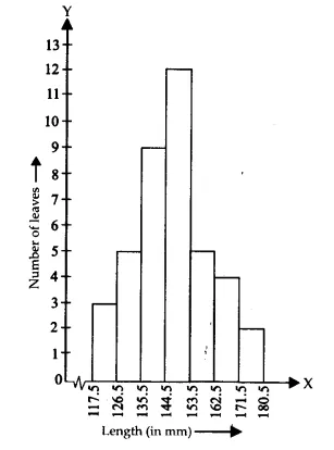
| Length (in mm) | Number of leaves |
| 118-126 | 3 |
| 127-135 | 5 |
| 136-144 | 9 |
| 145-153 | 12 |
| 154-162 | 5 |
| 163-171 | 4 |
| 172-180 | 2 |
Draw a histogram to represent the given data. [Hint: First make the class intervals continuous]
Answer:
Both upper and lower class limits must be modified by dividing their difference by 2 since the data has a 1-unit difference between its values( e.g 127 - 135 would become 126.5 - 235.5)
Therefore, the modified table is as follows:
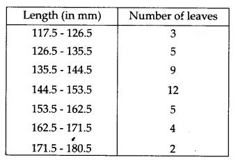
The representation of the above data through a histogram is as follows:
| Length (in mm) | Number of leaves |
| 118-126 | 3 |
| 127-135 | 5 |
| 136-144 | 9 |
| 145-153 | 12 |
| 154-162 | 5 |
| 163-171 | 4 |
| 172-180 | 2 |
Is there any other suitable graphical representation for the same data?
Answer:
Yes, the same data would be appropriately displayed by a frequency polygon.
| Length (in mm) | Number of leaves |
| 118-126 | 3 |
| 127-135 | 5 |
| 136-144 | 9 |
| 145-153 | 12 |
| 154-162 | 5 |
| 163-171 | 4 |
| 172-180 | 2 |
Is it correct to conclude that the maximum number of leaves are 153 mm long? Why?
Answer:
No, as the information provided does not establish 153 mm as the precise length for the maximum number of leaves. The data provides information only about the possible length range for the leaves. The available evidence supports the conclusion that 12 leaves have measurements contained within 145-153.
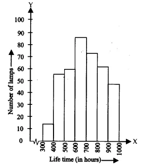
Q5 (i) The following table gives the life times of 400 neon lamps:
| Life time (in hours) | Number of lamps |
| 300-400 | 14 |
| 400-500 | 56 |
| 500-600 | 60 |
| 600-700 | 86 |
| 700-800 | 74 |
| 800-900 | 62 |
| 900-1000 | 48 |
Represent the given information with the help of a histogram.
Answer:
The representation of the given information in the form of a histogram is as follows:
Q5 (ii) The following table gives the life times of 400 neon lamps:
| Life time (in hours) | Number of lamps |
| 300-400 | 14 |
| 400-500 | 56 |
| 500-600 | 60 |
| 600-700 | 86 |
| 700-800 | 74 |
| 800-900 | 62 |
| 900-1000 | 48 |
How many lamps have a lifetime of more than 700 hours?
Answer:
Lamps having lifetime in the range 700 - 800 = 74
Lamps having lifetime in the range 800 - 900 = 62
Lamps having lifetime in the range 900 - 1000 = 48
Lamps having a lifetime of more than 700 hours = 74 + 62 + 48 = 184.
| Section A | Section B | ||
| Marks | Frequency | Marks | Frequency |
| 0-10 | 3 | 0-10 | 5 |
| 10-20 | 9 | 10-20 | 19 |
| 20-30 | 17 | 20-30 | 15 |
| 30-40 | 12 | 30-40 | 10 |
| 40-50 | 9 | 40-50 | 1 |
Represent the marks of the students of both the sections on the same graph by two frequency polygons. From the two polygons compare the performance of the two sections
Answer:
To make the frequency polygon, we first modify the table by using the following formula:
$\\Class\ marks= \frac{Upper\ limit\ of\ class\ interval+Lower\ limit\ of\ class\ interval}{2}$
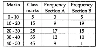
The frequency polygon requires markings which depict marks on the x-axis and student frequencies on the y-axis. A frequency polygon represents the given information in this manner:
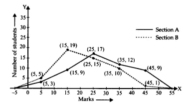
From the frequency polygon, we can see that the performance of section A is better.
Q7 The runs scored by two teams A and B on the first 60 balls in a cricket match are given below:
| Number of balls | Team A | Team B |
| 1-6 | 2 | 5 |
| 7-12 | 1 | 6 |
| 13-18 | 8 | 2 |
| 19-24 | 9 | 10 |
| 25-30 | 4 | 5 |
| 31-36 | 5 | 6 |
| 37-42 | 6 | 3 |
| 43-48 | 10 | 4 |
| 49-54 | 6 | 8 |
| 55-60 | 2 | 10 |
Represent the data of both the teams on the same graph by frequency polygons. [ Hint : First make the class intervals continuous.]
Answer:
To make the frequency polygon, we first modify the table by using the following formula:
$\\Class\ marks= \frac{Upper\ limit\ of\ class\ interval+Lower\ limit\ of\ class\ interval}{2}$
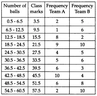
The frequency polygon requires markings which depict a number of balls on the x-axis and runs scored on the y-axis. A frequency polygon represents the given information in this manner:
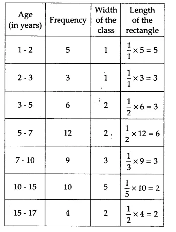
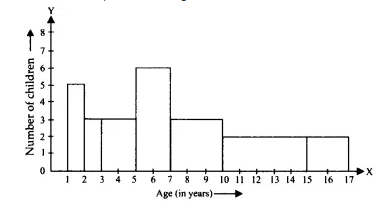
| Age (in years) | Number of children |
| 1-2 | 5 |
| 2-3 | 3 |
| 3-5 | 6 |
| 5-7 | 12 |
| 7-10 | 9 |
| 10-15 | 10 |
| 15-17 | 4 |
Draw a histogram to represent the data above.
Answer:
The calculation of weighted frequencies must be performed for each rectangle because different class sizes were used to construct the histogram.
$\\Weighted\ frequency=\frac{Minimum\ class\ size}{Class\ size\ of\ the\ interval}\times Frequency$
$Length\ of\ the\ rectangle=\frac{Minimum\ width}{Width\ of\ the\ rectangle}\times Frequency$
Minimum class size = 2 - 1 = 1
The modified table showing the weighted frequency as per the size of the class intervals is as follows:
The histogram representing the information given in the above table is as follows:
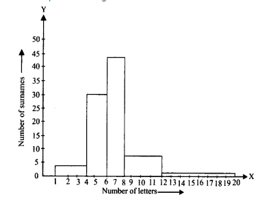
| Number of letters | Number of surnames |
| 1-4 | 6 |
| 4-6 | 30 |
| 6-8 | 44 |
| 8-12 | 16 |
| 12-20 | 4 |
Answer:
The calculation of weighted frequencies must be performed for each rectangle because different class sizes were used to construct the histogram.
$\\Weighted\ frequency=\frac{Minimum\ class\ size}{Class\ size\ of\ the\ interval}\times Frequency$
$Length\ of\ the\ rectangle=\frac{Minimum\ width}{Width\ of\ the\ rectangle}\times Frequency$
Minimum class size = 6 - 4 = 2
The modified table showing the weighted frequency as per the size of the class intervals is as follows:
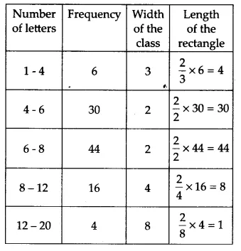
The histogram representing the information given in the above table is as follows:
| Number of letters | Number of surnames |
| 1-4 | 6 |
| 4-6 | 30 |
| 6-8 | 44 |
| 8-12 | 16 |
| 12-20 | 4 |
Write the class interval in which the maximum number of surnames lie.
Answer:
The largest number of surnames lies in the class interval of 6 - 8. This class interval's weighted frequency is 44 (assuming a minimum class size of 2).
Confused between CGPA and Percentage?
Get your results instantly with our calculator!
💡 Conversion Formula used is: Percentage = CGPA × 9.5
Topics covered in Chapter 12 Statistics: Exercise 12.1
- Understanding and constructing bar graphs: The representation of data through rectangular bars occurs using bar graphs. Every bar in this graph displays specific categories, while its height demonstrates the count or frequency of the respective group.
- Visual representation of grouped frequency data: The use of bars furnishes an easy way to display grouped data by representing various groups or ranges, which simplifies visual value comparison.
- Analysing patterns using bar diagrams: Bar diagrams help us quickly spot trends, such as the highest or lowest values, and make comparisons between different categories of data.
- Interpreting frequency distributions graphically: The distributions across multiple groups become visible in bar graphs, while readers can establish conclusions through measuring bar heights.
Check Out-
NCERT Solutions of Class 10 Subject Wise
Students must check the NCERT solutions for class 9 of Mathematics and Science Subjects.
NCERT Exemplar Solutions of Class 10 Subject Wise
Students must check the NCERT Exemplar solutions for class 9 of Mathematics and Science Subjects.
Frequently Asked Questions (FAQs)
Q: Define Histogram?
A:
Ans: a diagram made up of rectangles with areas proportional to the frequency of a variable and widths equal to the class interval
Q: What do you mean Bar graph?
A:
Ans: A bar graph is a chart or graphical presentation of facts, quantities, or numbers that practices that relate to or strips. Bar graphs are used to compare and contrast different types of information by simply comparing quantities, frequencies, or other measurements.
Q: Can we generate a relation between frequency and histogram?
A:
Ans: A frequency histogram is a sort of bar graph that displays the frequency or the number of times, an outcome happens in a data collection. It has a title, an x-axis, a y-axis, and vertical bars to graphically portray the data...
Q: What are Frequency Polygons?
A:
Ans: A frequency polygon is a graphical depiction of a distribution. The market looks are used to comprehend the form of a distribution.
Q: What is the difference between a histogram and frequency Polygons?
A:
Ans: The frequency histogram is analogous to a column graph, even though there are no gaps between the columns. A frequency polygon is a type of line graph that is used in statistics. These graphs can be created separately or in combination. These graphs may be created utilizing data from a frequency distribution table.
Q: Can we use Bar Graphs for Grouped data?
A:
Ans: Yes we can use bar graphs for grouped data.
Q: Which graph is used for the representation of two or more sectional tables?
A:
Ans: We generally use frequency polygon for these types of problems of joining or comparison
Q: What is the use of the range of data?
A:
Ans: Range of data gives the numerical value of (Max value of data – Min value of data) which
Will give an idea of variations in data given in port.
Articles
Upcoming School Exams

Popular Questions
A block of mass 0.50 kg is moving with a speed of 2.00 ms-1 on a smooth surface. It strikes another mass of 1.00 kg and then they move together as a single body. The energy loss during the collision is
| Option 1)
|
Option 2)
|
| Option 3)
|
Option 4)
|
An athlete in the olympic games covers a distance of 100 m in 10 s. His kinetic energy can be estimated to be in the range
| Option 1)
|
Option 2)
|
| Option 3)
|
Option 4)
|
A particle is projected at 600 to the horizontal with a kinetic energy . The kinetic energy at the highest point
| Option 1)
|
Option 2)
|
| Option 3)
|
Option 4)
|
In the reaction,
| Option 1)
|
Option 2)
|
| Option 3)
|
Option 4)
|
How many moles of magnesium phosphate, will contain 0.25 mole of oxygen atoms?
| Option 1)
0.02 |
Option 2)
3.125 × 10⁻² |
| Option 3)
1.25 × 10⁻² |
Option 4)
2.5 × 10⁻² |
Colleges After 12th
Applications for Admissions are open.
Study at a world-renowned UK university in India | Admissions open for UG & PG programs.
Victoria University, Delhi NCR
ApplyApply for UG & PG programmes from Victoria University, Delhi NCR Campus
Illinois Tech Mumbai
ApplyAdmissions open for UG & PG programs at Illinois Tech Mumbai
University of Aberdeen Mumbai
ApplyApply for UG & PG courses at University of Aberdeen, Mumbai Campus
University of York, Mumbai
ApplyUG & PG Admissions open for CS/AI/Business/Economics & other programmes.
University of Bristol, Mumbai Enterprise Campus
ApplyBristol's expertise meets Mumbai's innovation. Admissions open for UG & PG programmes