

NCERT Solutions for Class 9 Maths Chapter 12 Statistics
Hey! Still wondering whether to read this article? Don’t think twice. These solutions are made for you, explained, with brief concept overviews to clear your doubts. In a world full of numbers, statistics help us find meaning. Statistics is one of the important topics in the Class 9 NCERT syllabus. It is a powerful branch of mathematics that helps us systematically collect, organise, and interpret data, allowing us to analyse large amounts of information clearly and insightfully. For instance, we will use statistics to know the average marks of a class and the maximum average age of college students. The main components of statistics include data collection, data presentation (such as tables and graphs), and data analysis (including finding the mean, median, and mode). It is beneficial in everyday life and in plenty of fields. These NCERT solutions for Class 9 are created by the expert team at Careers360, keeping in mind the latest NCERT syllabus. NCERT Solutions are trusted by teachers for building a strong foundation in concepts.
This Story also Contains
- Statistics Class 9 Questions And Answers PDF Free Download
- NCERT Solutions for Class 9 Maths Chapter 12 Statistics: Exercise Questions
- Statistics Class 9 NCERT Solutions: Exercise-wise
- Class 9 Maths NCERT Chapter 12 Solutions: Extra Questions
- Statistics Class 9 Chapter 12: Topics
- NCERT Statistics Class 9 Solutions - Important Formulae
- Approach to Solve Questions of Statistics Class 9
- Why are Class 9 Maths Chapter 12 Statistics Question Answers Important?
- NCERT Solutions for Class 9 Maths Chapter-wise
- NCERT Books and NCERT Syllabus

Statistics is the art of learning from data. These NCERT solutions for Class 9 Maths cover the solutions for this particular topic in detail. Students who need Statistics Class 9 solutions will find this article very useful. It covers all the important Class 9 Maths Chapter 12 question answers. Also, NCERT study materials are especially useful for questions based on surveys, grouped frequency distributions, and data analysis in exams. This article on NCERT solutions for class 9 Maths Chapter 12 Statistics offers clear and step-by-step solutions for the exercise problems. For full syllabus coverage and solved exercises as well as a downloadable PDF, please visit this NCERT article.
Also, read,
Statistics Class 9 Questions And Answers PDF Free Download
To make maths learning easier, Careers360 experts have created these NCERT Solutions for Class 9 Maths Chapter 12 Statistics. A downloadable PDF has been provided—click the link below to access it.
NCERT Solutions for Class 9 Maths Chapter 12 Statistics: Exercise Questions
Here are the NCERT Class 9 Maths Chapter 12 Statistics question answers with clear and detailed solutions.
| Statistics Class 9 Question Answers Exercise: 12.1 Total Questions: 9 Page number: 163-166 |
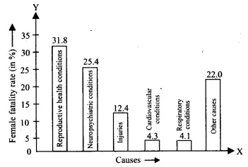
| Serial Number | Causes | Female fatality rate (%) |
| 1. | Reproductive health conditions | 31.8 |
| 2. | Neuropsychiatric conditions | 25.4 |
| 3. | Injuries | 12.4 |
| 4. | Cardiovascular conditions | 4.3 |
| 5. | Respiratory conditions | 4.1 |
| 6. | Other causes | 22.0 |
Represent the information given above graphically
Answer:
The graphical representation of the given data is as follows
| Serial Number | Causes | Female fatality rate (%) |
| 1. | Reproductive health conditions | 31.8 |
| 2. | Neuropsychiatric conditions | 25.4 |
| 3. | Injuries | 12.4 |
| 4. | Cardiovascular conditions | 4.3 |
| 5. | Respiratory conditions | 4.1 |
| 6. | Other causes | 22.0 |
Which condition is the major cause of women’s ill health and death worldwide?
Answer:
From the graph, we can see reproductive health conditions are the major cause of women’s ill health and death worldwide. The female fatality rate is 31.8% due to reproductive health conditions.
| Serial Number | Causes | Female fatality rate (%) |
| 1. | Reproductive health conditions | 31.8 |
| 2. | Neuropsychiatric conditions | 25.4 |
| 3. | Injuries | 12.4 |
| 4. | Cardiovascular conditions | 4.3 |
| 5. | Respiratory conditions | 4.1 |
| 6. | Other causes | 22.0 |
Try to find out, with the help of your teacher, any two factors that play a major role in the cause in (ii) above being the major cause.
Answer:
Due to poor financial conditions and the failure of the government to provide necessary healthcare conditions to women, reproductive health conditions are the major cause of ill health and death of women worldwide.
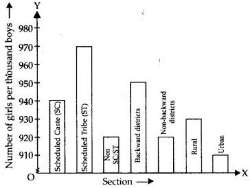
Question 2: (i) The following data on the number of girls (to the nearest ten) per thousand boys in different sections of Indian society is given below.
| Section | Number of girls per thousand boys |
| Schedule Caste (SC) | 940 |
| Schedule Tribe (ST) | 970 |
| Non SC/ST | 920 |
| Backward districts | 950 |
| Non-backward districts | 920 |
| Rural | 930 |
| Urban | 910 |
Represent the information above with a bar graph.
Answer:
The graphical representation of the given information is as follows.
Question 2: (ii) The following data on the number of girls (to the nearest ten) per thousand boys in different sections of Indian society is given below.
| Section | Number of girls per thousand boys |
| Schedule Caste (SC) | 940 |
| Schedule Tribe (ST) | 970 |
| Non SC/ST | 920 |
| Backward districts | 950 |
| Non-backward districts | 920 |
| Rural | 930 |
| Urban | 910 |
In the classroom, discuss what conclusions can be arrived at from the graph
Answer:
From the graph, we can see that the number of girls per thousand boys is the least in urban society and the highest in the Scheduled Tribes.
910 in the case of urban society and 970 in that of the Scheduled Tribes.
Question 3: (i) Given below are the seats won by different political parties in the polling outcome of a state assembly elections:
| Political Party | A | B | C | D | E | F |
| Seats Won | 75 | 55 | 37 | 29 | 10 | 37 |
Draw a bar graph to represent the polling results.
Answer:
The representation of the given data in the form of a bar graph is as follows.
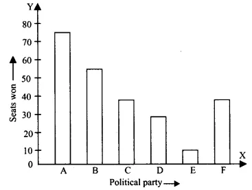
Question 3: (ii) Given below are the seats won by different political parties in the polling outcome of state assembly elections:
| Political Party | A | B | C | D | E | F |
| Seats Won | 75 | 55 | 37 | 29 | 10 | 37 |
Which political party won the maximum number of seats?
Answer:
Party A has won the maximum number of seats. Party A has won 75 seats.
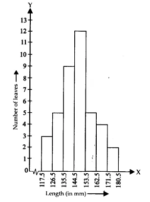
Question 4: (i) The length of 40 leaves of a plant is measured correctly by one millimeter, and the obtained data is represented in the following table:
| Length (in mm) | Number of leaves |
| 118-126 | 3 |
| 127-135 | 5 |
| 136-144 | 9 |
| 145-153 | 12 |
| 154-162 | 5 |
| 163-171 | 4 |
| 172-180 | 2 |
Draw a histogram to represent the given data. [Hint: First, make the class intervals continuous]
Answer:
As we can see from the given table, the data is discontinuous, and the difference between the upper limit of a class and the lower limit of the next class is 1; therefore, we change both of them by a value $\frac12$.
e.g 127 - 135 would become 126.5 - 135.5
The modified table, therefore, is
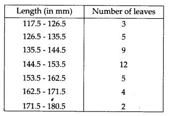
The representation of the above data through a histogram is as follows.
Question 4: (ii) The length of 40 leaves of a plant is measured correctly by one millimetre, and the obtained data is represented in the following table:
| Length (in mm) | Number of leaves |
| 118-126 | 3 |
| 127-135 | 5 |
| 136-144 | 9 |
| 145-153 | 12 |
| 154-162 | 5 |
| 163-171 | 4 |
| 172-180 | 2 |
Is there any other suitable graphical representation for the same data?
Answer:
A frequency polygon could be another suitable graphical representation for the same data.
Question 4: (iii) The length of 40 leaves of a plant is measured correctly by one millimetre, and the obtained data is represented in the following table:
| Length (in mm) | Number of leaves |
| 118-126 | 3 |
| 127-135 | 5 |
| 136-144 | 9 |
| 145-153 | 12 |
| 154-162 | 5 |
| 163-171 | 4 |
| 172-180 | 2 |
Is it correct to conclude that the maximum number of leaves is 153 mm long? Why?
Answer:
No, it is certainly not correct to conclude that the maximum number of leaves is 153 mm long because the given data does not tell us about the exact length of the leaves. It only tells us about the range in which their lengths lie. We can only conclude that the maximum number of leaves (12) have their lengths in the region 145 - 153.
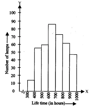
Question 5: (i) The following table gives the lifetimes of 400 neon lamps:
| Lifetime (in hours) | Number of lamps |
| 300-400 | 14 |
| 400-500 | 56 |
| 500-600 | 60 |
| 600-700 | 86 |
| 700-800 | 74 |
| 800-900 | 62 |
| 900-1000 | 48 |
Represent the given information with the help of a histogram.
Answer:
The representation of the given information in the form of a histogram is as follows.
Question 5: (ii) The following table gives the lifetimes of 400 neon lamps:
| Lifetime (in hours) | Number of lamps |
| 300-400 | 14 |
| 400-500 | 56 |
| 500-600 | 60 |
| 600-700 | 86 |
| 700-800 | 74 |
| 800-900 | 62 |
| 900-1000 | 48 |
How many lamps have a lifetime of more than 700 hours?
Answer:
Lamps having a lifetime in the range of 700 - 800 = 74
Lamps having a lifetime in the range of 800 - 900 = 62
Lamps having a lifetime in the range 900 - 1000 = 48
Lamps having a lifetime of more than 700 hours = 74 + 62 + 48 = 184
| Section A | Section B | ||
| Marks | Frequency | Marks | Frequency |
| 0-10 | 3 | 0-10 | 5 |
| 10-20 | 9 | 10-20 | 19 |
| 20-30 | 17 | 20-30 | 15 |
| 30-40 | 12 | 30-40 | 10 |
| 40-50 | 9 | 40-50 | 1 |
Represent the marks of the students of both sections on the same graph by two frequency polygons. From the two polygons, compare the performance of the two sections
Answer:
To make the frequency polygon, we first modify the table as follows
Class marks $= \frac{\text{Upper limit of class interval + Lower limit of class interval}}{2}$
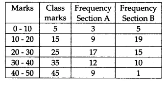
To make the frequency polygon, we mark the marks on the x-axis and the number of students on the y-axis.
The representation of the given information in the form of a frequency polygon is as follows.
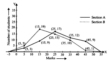
From the frequency polygon, we can see that the performance of section A is better.
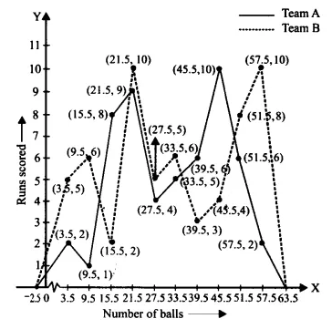
Question 7: The runs scored by two teams A and B on the first 60 balls in a cricket match are given below:
| Number of balls | Team A | Team B |
| 1-6 | 2 | 5 |
| 7-12 | 1 | 6 |
| 13-18 | 8 | 2 |
| 19-24 | 9 | 10 |
| 25-30 | 4 | 5 |
| 31-36 | 5 | 6 |
| 37-42 | 6 | 3 |
| 43-48 | 10 | 4 |
| 49-54 | 6 | 8 |
| 55-60 | 2 | 10 |
Represent the data of both teams on the same graph by frequency polygons. [ Hint: First, make the class intervals continuous.]
Answer:
The given data is not continuous; we therefore modify the limits of the class intervals as well to make the class intervals continuous.
To make the frequency polygon, we first modify the table as follows
Class marks $= \frac{\text{Upper limit of class interval + Lower limit of class interval}}{2}$
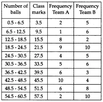
To make the frequency polygon, we mark the number of balls on the x-axis and the runs scored on the y-axis.
The representation of the given information in the form of a frequency polygon is as follows.
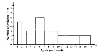
Question 8: A random survey of the number of children of various age groups playing in a park was found as follows:
| Age (in years) | Number of children |
| 1-2 | 5 |
| 2-3 | 3 |
| 3-5 | 6 |
| 5-7 | 12 |
| 7-10 | 9 |
| 10-15 | 10 |
| 15-17 | 4 |
Draw a histogram to represent the data above.
Answer:
Since the class sizes vary to make the histogram, we have to calculate the weighted frequency for each rectangle as per its width
Weighted frequency$=\frac{\text{Minimum class size}}{\text{Class size of the interval}}\times$ Frequency
Length of the rectangle $=\frac{\text{Minimum width}}{\text{Width of the rectangle}}\times$ Frequency
Minimum class size = 2 - 1 = 1
The modified table showing the weighted frequency as per the size of the class intervals is as follows.
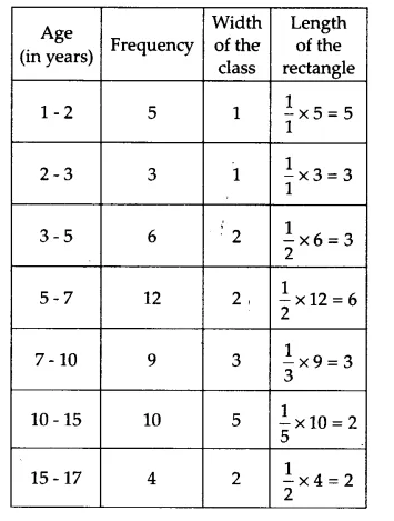
The histogram representing the information given in the above table is as follows.
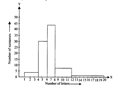
| Number of letters | Number of surnames |
| 1-4 | 6 |
| 4-6 | 30 |
| 6-8 | 44 |
| 8-12 | 16 |
| 12-20 | 4 |
Answer:
Since the class sizes vary, to make the histogram, we have to calculate the weighted frequency for each rectangle as per its width
Weighted frequency$=\frac{\text{Minimum class size}}{\text{Class size of the interval}}\times$ Frequency
Length of the rectangle $=\frac{\text{Minimum width}}{\text{Width of the rectangle}}\times$ Frequency
Minimum class size = 6 - 4 = 2
The modified table showing the weighted frequency as per the size of the class intervals is as follows.
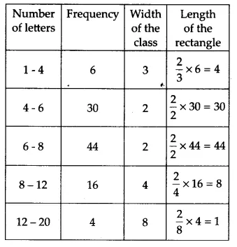
The histogram representing the information given in the above table is as follows.
| Number of letters | Number of surnames |
| 1-4 | 6 |
| 4-6 | 30 |
| 6-8 | 44 |
| 8-12 | 16 |
| 12-20 | 4 |
Write the class interval in which the maximum number of surnames lie.
Answer:
The class interval in which the maximum number of surnames lie is 6 - 8
The weighted frequency of this class interval (taking 2 as the minimum class size) is 44.
Confused between CGPA and Percentage?
Get your results instantly with our calculator!
Statistics Class 9 NCERT Solutions: Exercise-wise
Exercise-wise NCERT Solutions of Statistics Class 9 Maths Chapter 12 are provided in the link below.
Class 9 Maths NCERT Chapter 12 Solutions: Extra Questions
Question 1: Find the median of the following data:
| Class Interval | Frequency | Cumulative Frequency |
| 0 - 10 | 2 | 2 |
| 10 - 20 | 4 | 6 |
| 20 - 30 | 6 | 12 |
| 30 - 40 | 3 | 15 |
| 40 - 50 | 5 | 20 |
Answer:
Total frequency $N=2+4+6+3+5=20$
Therefore, $\frac{N}{2}=10$
Thus, the median class is 20-30, as its CF just exceeds 10.
Using the formula:
$
\begin{aligned}
& \text { Median }=l+\left(\frac{\frac{N}{2}-C F}{f}\right) \times h \\
& =20+\left(\frac{10-6}{6}\right) \times 10=20+\left(\frac{4}{6}\right) \times 10 \\
& =20+6.67 \\
& =26.67
\end{aligned}
$
Question 2:
The bar graph given below shows the salaries of 6 employees of a company.

What is the ratio of the salary of J to the salary of M?
Answer:
The salary of J = 75
The salary of M = 100
Required ratio = 75 : 100 = 3 : 4
Hence, the correct answer is 3 : 4.
Question 3:
The below bar graph shows the number of toys sold by five different shops (i.e., A, B, C, D, and E) in the first week and second week.

Find the ratio of the total number of toys sold by shops A, B, and C in the first week to the number of toys sold by shops C, D, and E in the second week.
Answer:
Total number of toys sold by shops A, B, and C in the first week = 20 + 40 + 30 = 90
Total number of toys sold by shops C, D, and E in the second week = 20 + 60 + 50 = 130
Ratio = 90 : 130 = 9 : 13
Hence, the correct answer is 9 : 13.
Question 4:
Directions: Study the following histogram of wage distribution of different numbers of workers and answer the given questions.

The number of workers who earn more than Rs. 950 is:
Answer:
Number of workers with wages ranging from Rs. 950 to Rs. 960 = 10
Number of workers with wages ranging from Rs. 960 to Rs. 970 = 5
Number of workers with wages ranging from Rs. 970 to Rs. 980 = 3
Number of workers with wages ranging from Rs. 980 to Rs. 990 = 3
Number of workers with wages ranging from Rs. 990 to Rs. 1000 = 5
$\therefore$ The number of workers who earn more than Rs. 950 = 10 + 5 + 3 + 3 + 5 = 26
Hence, the correct answer is 26.
Question 5:
The following histogram shows the monthly income range of families staying in an apartment.

What is the difference between the total number of families whose income is more than or equal to 10000 but less than or equal to 25000 and the total number of families whose income is more than 35000 but less than or equal to 50000?
Answer:
Families whose income is more than or equal to 10000 but less than or equal to 25000 = 3 + 4 + 8 = 15
The total number of families whose income is more than 35000 but less than or equal to 50000
= 10 + 4 + 5 = 19
Difference = 19 –15 = 4
Hence, the correct answer is 4.
Statistics Class 9 Chapter 12: Topics
Topics you will learn in NCERT Class 9 Maths Chapter 12 Statistics include:
- Graphical Representation of Data
(A) Bar Graphs
(B) Histogram
(C) Frequency Polygon - Summary
NCERT Statistics Class 9 Solutions - Important Formulae
Bar graph
Data represented with rectangular bars, where one parameter is given on the x-axis and the other parameter is given on the y-axis, is called a bar graph.
These bars can be drawn horizontally or vertically. Every bar represents a different category, and the length of the bar is its value.
Histogram
Similar to a bar graph, it represents the distribution of numerical data by showing the number of data points that fall within a specified range.
It is used to visualise the frequency distribution of a dataset.
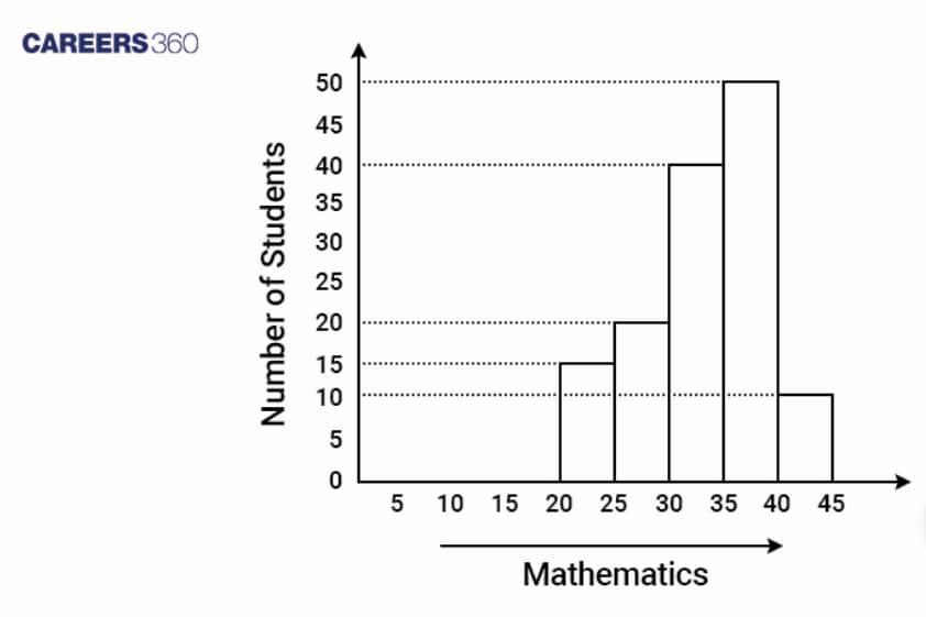
Example:
The following is a histogram of the marks in mathematics (out of 50) of students in a class.
Frequency Polygon
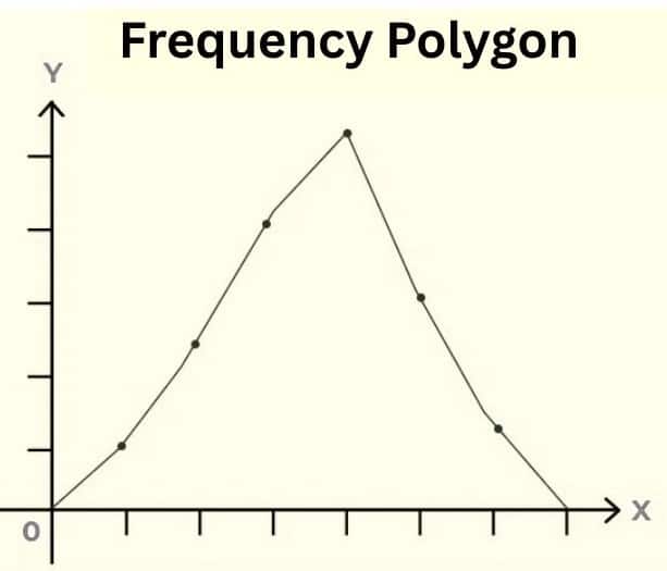
A frequency polygon is a line graph that shows data distribution by plotting frequencies against class midpoints, with points connected by straight lines to form a closed polygon that touches the x-axis. It is similar to a histogram but offers a clearer comparison of multiple datasets and helps visualise trends, skewness, and other distribution characteristics.
Class Mark = $\frac{\text{(Lower Limit + Upper Limit)}} 2$
Measures of Central Tendency
Mean (x̄):
The mean is calculated as the sum of all observations divided by the total number of observations.
-
Mean (x̄) = $\frac{\text{Sum of all observations }(∑x_n) }{\text{ Total Number of observations (N)}}$
Median:
The median is the middle value in a data set when the observations are arranged in ascending or descending order.
-
For an even number of observations, the median is the average of the two middlemost observations.
-
For an odd number of observations, the median is the value of the $\frac{(n+1)}2$th observation.
Mode:
The mode is the observation that occurs most frequently or has the maximum frequency in the given data set.
Approach to Solve Questions of Statistics Class 9
Using these approaches, students can tackle the Statistics Class 9 Chapter 12 Question Answers with greater confidence.
1. Understand data types: The correct solution method requires understanding raw data from ungrouped and grouped data types.
2. Construct frequency tables: Correct knowledge of data organisation into class intervals, along with frequencies, leads to successful calculation of mean, median or mode.
3. Use appropriate formulas: Determine which mathematical method to apply for the question through the directed mean computation, the cumulative median calculation, and the mode equation operation.
4. Practice histogram and polygon plotting: Drawing all bar graphs, histograms, and frequency polygons must be done accurately to prevent errors when class widths are not equal.
5. Check class boundaries: Before using statistical formulas, verify that grouped frequency tables do not exhibit any gaps between class intervals.
6. Simplify arithmetic step-by-step: The process of calculation simplification must occur in multiple stages, and the mid-point round-off should be prevented to guarantee precise statistical values.
Why are Class 9 Maths Chapter 12 Statistics Question Answers Important?
Statistics help us collect, organise, and thoroughly understand data. This chapter teaches us how to show information using graphs like bar graphs, histograms, and frequency polygons. These Class 9 Maths Chapter 12 Statistics question answers help students learn these skills with clear explanations and examples. Here are some points about why these question answers are important:
- These solutions help you understand how to present data in different graphical forms.
- These question answers make it easier to compare and study information from real-life situations.
- These Class 9 Maths Chapter 12 Statistics question answers prepare us for higher classes, where we will study advanced data handling and probability.
- They also improve your ability to read, analyse, and draw conclusions from data.
NCERT Solutions for Class 9 Maths Chapter-wise
For students' preparation, Careers360 has gathered all Class 9 Maths NCERT solutions here for quick and convenient access.
NCERT Books and NCERT Syllabus
Given below are some useful links for the NCERT books and the NCERT syllabus for class 9:
- NCERT Books Class 9 Maths
- NCERT Books for Class 9 Science
- NCERT Syllabus Class 9 Maths
- NCERT Books Class 9
- NCERT Syllabus Class 9
NCERT Solutions for Class 9 Maths Chapter 12 help students understand data handling through clear explanations of graphical methods. Bar graphs, histograms, and frequency polygons are explained with step-by-step examples for easy interpretation. Practising these solutions improves accuracy in reading and representing data. Overall, they build a strong foundation for statistics used in higher classes and real-life situations.
Frequently Asked Questions (FAQs)
This chapter includes a collection of data, presentation of data using tables, bar graphs, histograms, frequency polygons, and measures of central tendency like mean, median, and mode.
NCERT Maths Chapter 12 class 9 solutions are helpful for the students if they get stuck while solving NCERT problems. Also, these solutions are provided in a very detailed manner, which will give them conceptual clarity. Practising these NCERT solutions provides an in-depth understanding of concepts that leads to confidence in the exam, and ultimately, higher marks in the exam.
NCERT Solutions provide clear, step-by-step methods for solving problems related to data representation and measures of central tendency, making it easier to understand and apply concepts.
Yes, you can download the NCERT Solutions for Class 9 Maths Chapter 12 Statistics as a free PDF for offline practice from various trusted educational websites such as Careers360.
In a bar graph, bars are separated and can represent any kind of data, while in a histogram, bars are adjacent (no gaps) and represent continuous data in intervals.
A histogram is a type of graph that represents continuous data using adjacent bars. There are no gaps between the bars, and each bar represents a class interval.
A frequency polygon is a line graph that shows frequencies of different classes using points connected by straight lines.
Statistics help us understand data in everyday life, such as tracking exam results, comparing temperatures, analysing surveys, or studying sports performances.

Popular Questions
A block of mass 0.50 kg is moving with a speed of 2.00 ms-1 on a smooth surface. It strikes another mass of 1.00 kg and then they move together as a single body. The energy loss during the collision is
| Option 1)
|
Option 2)
|
| Option 3)
|
Option 4)
|
An athlete in the olympic games covers a distance of 100 m in 10 s. His kinetic energy can be estimated to be in the range
| Option 1)
|
Option 2)
|
| Option 3)
|
Option 4)
|
A particle is projected at 600 to the horizontal with a kinetic energy . The kinetic energy at the highest point
| Option 1)
|
Option 2)
|
| Option 3)
|
Option 4)
|
In the reaction,
| Option 1)
|
Option 2)
|
| Option 3)
|
Option 4)
|
How many moles of magnesium phosphate, will contain 0.25 mole of oxygen atoms?
| Option 1)
0.02 |
Option 2)
3.125 × 10⁻² |
| Option 3)
1.25 × 10⁻² |
Option 4)
2.5 × 10⁻² |