Aakash Repeater Courses
ApplyTake Aakash iACST and get instant scholarship on coaching programs.

Scan and Download the App!
Scan and Download the App!
Scan and Download the App!
Scan and Download the App!
Scan and Download the App!
Scan and Download the App!
Scan and Download the App!
Scan and Download the App!
Scan and Download the App!
Scan and Download the App!
Scan and Download the App!
Scan and Download the App!
Scan and Download the App!
 4.2
4.2
From tracking your exam scores to seeing how your height increases each year, graphs help you see change in everyday life. A graph is not just a pictorial representation of relationships in data, but a map that contains relationships that may be undiscovered from numbers alone. The 11th chapter of the NCERT Class 8, Introduction to Graphs, helps students learn about methods for using graphs to represent and describe data. The various kinds of graphs you will see include bar graphs, Histograms, pie graphs (also called pie charts or circle graphs), line graphs, and linear graphs. Acceptable use of the different kinds of graphs depends on your data and purposes. For example, bar graphs compare quantities, Histograms display data spread over ranges, pie charts display data parts of a whole, line graphs show data changes over time, and linear graphs show data that demonstrates constant relationships when plotted as a straight line. The use of various types of graphs can create understanding and strengthen learning. The primary objective of these NCERT Solutions for Class 8 is to teach students how to utilise graphs to visualise, compare, and understand the data more easily, making mathematics clearer and life smarter.
Introduction to Graphs is your first step towards seeing math visually. Carefully curated by Careers360 experts, these Class 8 NCERT Solutions match the CBSE 2025-26 syllabus and updated exam pattern. In the NCERT Solutions for Class 8 Maths Chapter 13, students will find step-by-step explanations of the questions and various solved questions to improve their understanding. Using graphs turns numbers into pictures, making patterns visible and trends clear. For complete syllabus mapping, easy notes, and PDFs, check out: NCERT.
Students who wish to access the NCERT solutions for class 8, chapter 13, Introduction to Graphs, can click on the link below to download the entire solution in PDF.
| Class 8 Maths Chapter 13 Question Answer: Exercise: 13.1 Total Questions: 7 Page number: 160-163 |
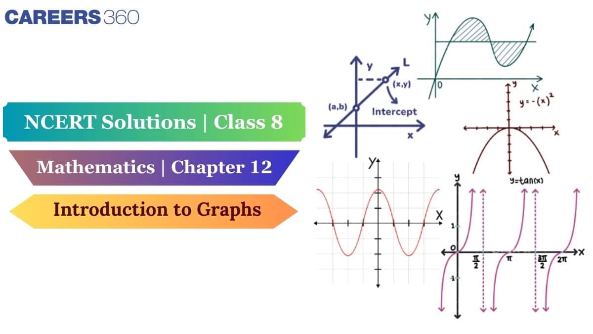
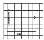
Question: 1(a) The following graph shows the temperature of a patient in a hospital, recorded every hour.
What was the patient's temperature at 1 p.m.

![]()
Answer:
(a) The patient's temperature at 1 p.m. is
Question: 1(b) The following graph shows the temperature of a patient in a hospital recorded every hour.
When was the patient's temperature
![]()
Answer:
(b) The patient's temperature is
Question: 1(c) The following graph shows the temperature of a patient in a hospital recorded every hour.

![]()
Answer:
(c) The patient's temperature was the same two times during the period, given that these two times are 1 p.m. and 2 p.m.
Question: 1(d) The following graph shows the temperature of a patient in a hospital recorded every hour.
What was the temperature at 1:30 p.m.? How did you arrive at your answer?

![]()
Answer:
(d) The temperature at 1:30 p.m is
Question: 1(e) The following graph shows the temperature of a patient in a hospital recorded every hour.
During which periods did the patient's temperature show an upward trend?

![]()
Answer:
(e) The patient's temperature showed an upward trend- 9 am to 10 am, 10 am to 11 am, and 2 pm to 3 pm
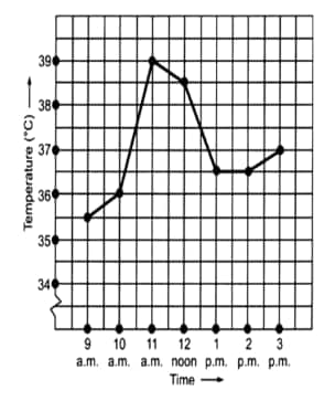
Question: 2(a) The following line graph shows the yearly sales figures for a manufacturing company.
What are the sales in (1) 2002, (2) 2006?

![]()
Answer:
(a) The sales in
(1) 2002 = 4 crore
(2) 2006 = 8 crore
Question: 2(b) The following line graph shows the yearly sales figures for a manufacturing company.
What are the sales in (1) 2003, (2) 2005?

![]()
Answer:
(b) The sales in
(1) 2003 = 7 crore
(2) 2005 = 10 crore
Question: 2(c) The following line graph shows the yearly sales figures for a manufacturing company.
Compute the difference between sales in 2002 and 2006
![]()
Answer:
(c) The difference between sales in 2002 and 2006 is
Question: 2(d) The following line graph shows the yearly sales figures for a manufacturing company
In which year was there the greatest difference between the sales and compared to its previous year?

![]()
Answer:
(d) The greatest difference between the sales as compared to its previous year is $10-6=4 crores between 2004 and 2005.
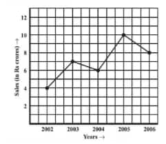
How high was Plant A after (i) 2 weeks, (ii) 3 weeks?

![]()
Answer:
(a) Plant A after
(i) 2 weeks = 7 cm height.
(ii) 3 weeks = 9 cm height.

![]()
Answer:
(b) Plant B after
(i) 2 weeks = 7 cm height.
(ii) 3 weeks = 10cm height.
How much did Plant A grow during the 3rd week?

![]()
Answer:
(c)The Plant A grow during the 3rd week =
How much did Plant B grow from the end of the 2nd week to the end of the 3rd week?
![]()
Answer:
(d)The Plant B grows from the end of the 2nd week to the end of the 3rd week,
During which week did Plant A grow the most?

![]()
Answer:
(e)The week in which Plant A grows most during the 2nd week =
Question: 3(f) For an experiment in Botany, two different plants, plant A and plant B, were grown under similar laboratory conditions. Their heights were measured at the end of each week for 3 weeks. The results are shown by the following graph.
During which week did Plant B grow the least?

![]()
Answer:
(f) The week in which Plant B grows least is during the first week =
Question: 3(g) For an experiment in Botany, two different plants, plant A and plant B, were grown under similar laboratory conditions. Their heights were measured at the end of each week for 3 weeks. The results are shown by the following graph.
Were the two plants of the same height during any week shown here? Specify.

![]()
Answer:
(g) At the end of the second week, the heights of both plants are the same.

![]()
Answer:
(a) The forecast temperature is the same as the actual temperature on Tuesday, Friday, and Sunday.
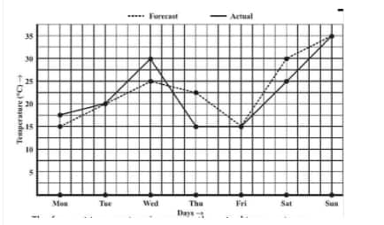
Question: 4(b) The following graph shows the temperature forecast and the actual temperature for each day of a week.
What was the maximum forecast temperature during the week?

![]()
Answer:
(b) The maximum forecast temperature during the week was
Question: 4(c) The following graph shows the temperature forecast and the actual temperature for each day of a week.
What was the minimum actual temperature during the week?
![]()
Answer:
(c) The minimum actual temperature during the week is
Question: 4(d) The following graph shows the temperature forecast and the actual temperature for each day of a week.
On which day did the actual temperature differ the most from the forecast temperature?

![]()
Answer:
(d) The actual temperature differs the most from the forecast temperature on Thursday.
Question: 5(a) Use the tables below to draw linear graphs.
The number of days a hillside city received snow in different years.
![]()
![]()
Answer:
(a) The linear graph of the data given above is as shown :
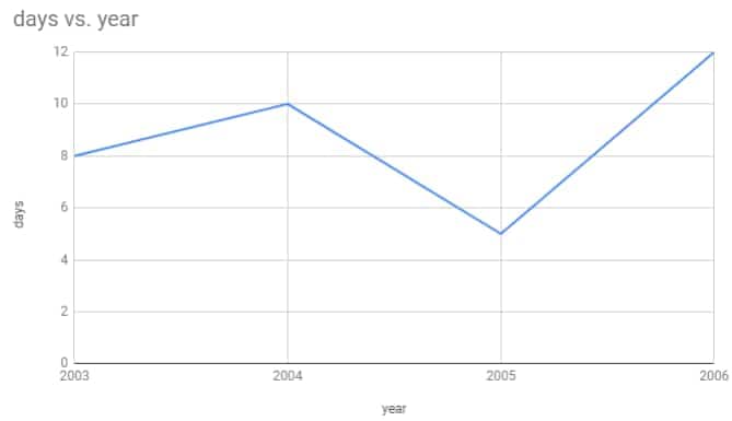
![]()
Question: 5(b) Use the tables below to draw linear graphs.
Population (in thousands) of men and women in a village in different years.
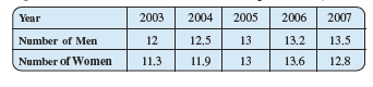
![]()
Answer:
(b) The graph of the data given above is as shown :
Taking years as the x-axis and population as y- y-axis.
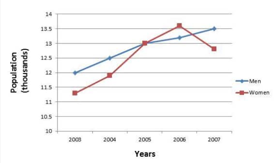
![]()

![]()
Answer:
(a) The scale taken for the time axis (x-axis) is 4 units = 1 hour.
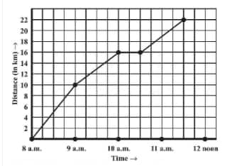
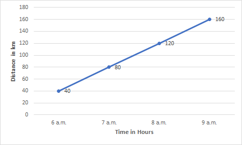
Question: 6(b) A courier-person cycles from a town to a neighbouring suburban area to deliver a parcel to a merchant. His distance from the town at different times is shown by the following graph.
How much time did the person take for the trip?

![]()
Answer:
(b) The person travels from 8 a.m. to 11:30 a.m.
How far is the place of merchant from the town?

![]()
Answer:
(c) The place of the merchant from the town is 22 km away.
Question: 6(d) A courier-person cycles from a town to a neighbouring suburban area to deliver a parcel to a merchant. His distance from the town at different times is shown by the following graph.
Did the person stop on his way? Explain.

![]()
Answer:
(d) From 10 a.m. to 10:30 a.m., there is a horizontal line which states that the person stops from 10 a.m. to 10:30 a.m.
Question: 6(e) A courier-person cycles from a town to a neighbouring suburban area to deliver a parcel to a merchant. His distance from the town at different times is shown by the following graph.
During which period did he ride fastest?
![]()
Answer:
(e) From the graph, we can observe person travels the maximum distance from 8 a.m. to 9 a.m.
Hence, a person travels fastest from 8 a.m. to 9 a.m.
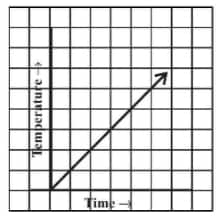
Question: 7(i) Can there be a time-temperature graph as follows? Justify your answer.
![]()
Answer:
(i) Yes, there can be a time-temperature graph as shown, with the increase in time, the temperature also increases.
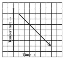
Question: 7(ii) Can there be a time-temperature graph as follows? Justify your answer.
![]()
Answer:
(ii) Yes, it is possible that with an increase in time, temperature decreases.
Question: 7(iii) Can there be a time-temperature graph as follows? Justify your answer.
![]()
Answer:
(iii) No, this type of graph is not possible because different temperatures at the same time are not possible.
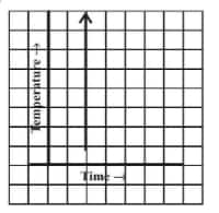
Question: 7(iv) Can there be a time-temperature graph as follows? Justify your answer
![]()
Answer:
(iv) Yes, it is possible, i.e. same temperature at different times is possible.
| Class 8 Maths Chapter 13 Question Answer: Exercise: 13.2 Total Questions: 2 Page number: 168-169 |
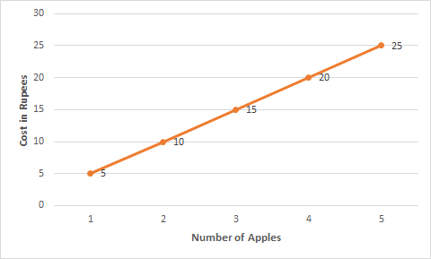
Question: 1(a) Draw the graphs for the following tables of values, with suitable scales on the axes.
Cost of apples
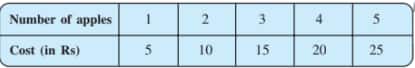
![]()
Answer:
(a) Cost of apples
![]()
Question: 1(b) Draw the graphs for the following tables of values, with suitable scales on the axes. Distance travelled by a car.
(i)How much distance did the car cover during the period 7.30 a.m. to 8 a.m.?
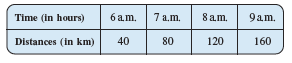
![]()
Answer:

![]()
(i)From the above graph, the distance the car covers during the period 7.30 a.m. to 8 a.m. is
Question: 1(b) Draw the graphs for the following tables of values, with suitable scales on the axes.

![]()
(ii) What was the time when the car had covered a distance of 100 km since its start
Answer:
(b)
![]()
(ii)From the above graph, we conclude that at 7:30 a.m., the car had covered a distance of 100 km since its start.
Question: 1(c) Interest on deposits for a year.

![]()
(i) Does the graph pass through the origin?
Answer:

![]()
Taking the x-axis as 1000 units = 1 box and the y-axis as 100 units = 1 box.
(i)Yes, the graph passes through the origin.
Question: 1(c) Interest on deposits for a year
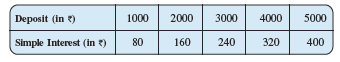
![]()
(ii) Use the graph to find the interest on Rs 2500 for a year.
Answer:
(c)

![]()
(ii) Using the graph, the interest on Rs 2500 for a year is Rs 200.
Question: 1(c) Interest on deposits for a year.

![]()
(iii) To get an interest of Rs 280 per year, how much money should be deposited?
Answer:
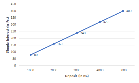
![]()
(iii) From the graph, to get an interest of Rs 280 per year, Rs 3500 should be deposited.
Question: 2(i) Draw a graph for the following. Is it a linear graph
![]()
Answer:
![]()
From the above graph, we conclude that the graph is linear.
Question: 2(ii) Draw a graph for the following
![]()
Answer:
![]()
From the above graph, we conclude that the graph is not linear.
The topics discussed in the NCERT Solutions for class 8, chapter 11, Introduction to Graphs, are:
We at Careers360 compiled all the NCERT class 8 Maths solutions in one place for easy student reference. The following links will allow you to access them.
Students can find subject-wise solutions for various subjects from the links below.
The following links will take students to the latest CBSE syllabus and some reference books.
A block of mass 0.50 kg is moving with a speed of 2.00 ms-1 on a smooth surface. It strikes another mass of 1.00 kg and then they move together as a single body. The energy loss during the collision is
| Option 1)
|
Option 2)
|
| Option 3)
|
Option 4)
|
An athlete in the olympic games covers a distance of 100 m in 10 s. His kinetic energy can be estimated to be in the range
| Option 1)
|
Option 2)
|
| Option 3)
|
Option 4)
|
A particle is projected at 600 to the horizontal with a kinetic energy . The kinetic energy at the highest point
| Option 1)
|
Option 2)
|
| Option 3)
|
Option 4)
|
In the reaction,
| Option 1)
|
Option 2)
|
| Option 3)
|
Option 4)
|
How many moles of magnesium phosphate, will contain 0.25 mole of oxygen atoms?
| Option 1)
0.02 |
Option 2)
3.125 × 10⁻² |
| Option 3)
1.25 × 10⁻² |
Option 4)
2.5 × 10⁻² |
Take Aakash iACST and get instant scholarship on coaching programs.

This ebook serves as a valuable study guide for NEET 2025 exam.

This e-book offers NEET PYQ and serves as an indispensable NEET study material.

As per latest syllabus. Physics formulas, equations, & laws of class 11 & 12th chapters
As per latest syllabus. Chemistry formulas, equations, & laws of class 11 & 12th chapters
As per latest 2024 syllabus. Study 40% syllabus and score upto 100% marks in JEE

Student Community: Where Questions Find Answers